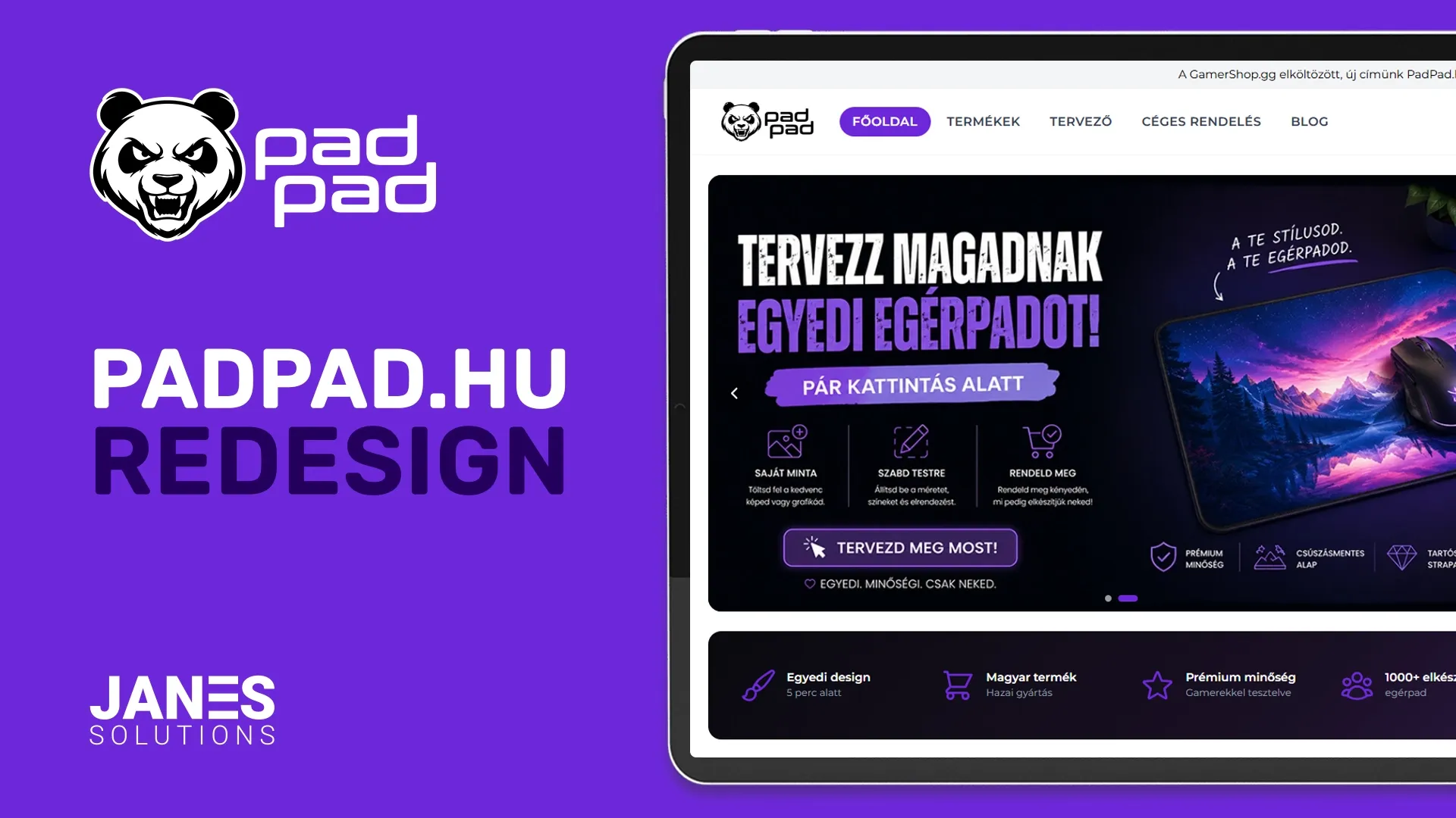
A detailed case study of the PadPad.hu webshop redesign, covering catalog expansion to 150+ products, AI-powered image processing, automated SEO generation, Google Merchant Center integration, technical SEO improvements, and conversion-focused homepage redesign.
PadPad.hu Redesign – Rethinking Design, SEO and the Product Catalog
In our previous case study, we talked about how we migrated from a template-based WooCommerce webshop to a fully custom-built solution. After replacing the engine, the next logical step was a complete visual refresh to keep up with modern trends.
What I really wasn't happy with was the homepage.
When you walk into a pastry shop, you usually choose the cake that looks the best. You don't know how it tastes yet, but the appearance is the very first thing you notice. The same applies to e-commerce. Because of that, this phase of the project focused heavily on design, user experience, and SEO.
Rethinking the Product Catalog
The first thing we revisited was the product offering itself.
Previously, the webshop had around 10-20 base products and the main focus was on the custom designer tool. Looking back, that wasn't the best decision.
Many customers don't actually want to upload their own graphics. They prefer browsing and selecting from ready-made designs.
I noticed this myself when I wanted to order a new phone case. I considered using a family photo, but in the end I didn't. I simply picked an abstract design and completed the order.
Based on this observation, I used AI to help identify a few key categories worth targeting in this market. Then I explored what kinds of visuals would fit those categories. AI also helped generate dozens of ideas for each category.
For every category, I generated 10-20-30 concepts, selected the ones I liked the most, and created the final graphics.
However, the process didn't stop there.
Once a graphic is added to the system, an automated processing pipeline takes over. Using the OpenAI API, the system analyzes the image, determines the most relevant categories, generates tags, and extracts the 4-5 most dominant colors. These attributes are later used for categorization, filtering, and search functionality.
The system also automatically generates:
Product titles
SEO titles
Meta descriptions
Basic product descriptions
Relevant keywords
Of course, all generated content can be edited manually at any time, but the automation significantly speeds up the process of adding new products.
Today, the webshop contains more than 150 products, creating a much friendlier shopping experience compared to the original catalog.
Redesigning the Homepage
Once the product catalog was expanded, it was time to rethink the homepage.
The previous homepage video looked great. It was unique and visually appealing.
The problem was that it didn't encourage visitors to take any action.
The current hero slider combined with the Daily Deal section creates much stronger purchase intent.
The slider highlights:
Seasonal collections
Current promotions
The custom design tool
Next to it, visitors can find the Daily Deal section.
Behind the scenes, a scheduled task runs every night at midnight. It randomly selects one XL mouse pad, applies roughly a 40% discount, and restores the previous day's discounted product to its original price.
As a result, visitors see a fresh offer every day.
For example, a 5990 HUF mouse pad may be available for 3590 HUF. In many cases, the discounted product including shipping costs less than a regular full-price order.
Not a bad deal.
Below the hero section we introduced a short information bar where we briefly explain who we are and what we offer.
This is followed by a featured products section where we showcase seasonal collections, bestsellers, and occasionally limited editions.
Next comes a pain-point section.
Below that, visitors can browse categories represented by images and category names.
We also added a step-by-step explanation of the custom ordering process to help users reach their goal as quickly as possible.
Of course, customer reviews couldn't be left out. Real reviews from our Facebook and Google pages are displayed directly on the homepage.
Finally, the page ends with a FAQ section.
SEO Improvements
The redesign wasn't only about visuals.
A significant amount of effort went into improving the technical SEO foundation of the webshop.
Every page now has its own SEO configuration options, including:
SEO title
Meta description
Social sharing image
Breadcrumb data
JSON-LD schema configuration
The goal was to make every page independently optimizable, including products, categories, and content pages.
The system automatically handles structured data, breadcrumbs, and other schema information required by search engines.
Google Merchant Center integration was also implemented, with daily synchronization of product data.
In addition, Google Search Console integration was added. Sitemaps are generated automatically and can be submitted through the API for indexing and validation.
The SEO workflow itself is also partially supported by AI, making it possible to maintain optimization efforts even as the product catalog continues to grow.
Visual Identity
I also wasn't completely satisfied with the previous color palette.
The black, white, and gray combination was clean, but it wasn't particularly memorable.
We ultimately chose purple as the primary brand color because it is often associated with premium products, exclusivity, and high quality. Since that is exactly the feeling we want to communicate, it felt like the right choice.
Newsletter Signup
We also introduced a newsletter signup section.
New subscribers receive a 10% discount, giving visitors an additional reason to stay connected even if they don't make a purchase immediately.
Category and Product Pages
The category and product pages remained largely unchanged because they were already performing well.
However, the category page received a few improvements, including:
Tag-based filtering
Color-based filtering
We didn't see much value in adding additional filters because pricing is primarily determined by the three available sizes. Most of the variation comes from the design itself.
Technology Stack
The frontend was built using:
Tailwind CSS
Livewire
Alpine.js
The backend continues to run on Laravel.
Conclusion
The goal of this project wasn't simply to create a better-looking webshop.
Expanding the product catalog, improving homepage conversions, strengthening the SEO foundation, introducing AI-assisted content management, and creating a stronger premium brand identity were all equally important objectives.
The result is a faster, more modern, and far more scalable webshop that supports both customer needs and long-term organic growth.